Zeitpunkt              Nutzer    Delta   Tröts        TNR     Titel                     Version  maxTL
Fr 05.07.2024 00:00:07   183.032      +3    5.876.679    32,1 Mastodon                  4.2.10     500
Do 04.07.2024 00:00:37   183.029      +8    5.870.017    32,1 Mastodon                  4.2.9      500
Mi 03.07.2024 00:00:07   183.021       0    5.863.973    32,0 Mastodon                  4.2.9      500
Di 02.07.2024 00:03:52   183.021      +6    5.857.080    32,0 Mastodon                  4.2.9      500
Mo 01.07.2024 00:00:30   183.015      -3    5.874.502    32,1 Mastodon                  4.2.9      500
So 30.06.2024 00:00:07   183.018      +8    5.869.053    32,1 Mastodon                  4.2.9      500
Sa 29.06.2024 00:03:02   183.010     +10    5.863.998    32,0 Mastodon                  4.2.9      500
Fr 28.06.2024 00:04:36   183.000      +7    5.857.209    32,0 Mastodon                  4.2.9      500
Do 27.06.2024 00:00:41   182.993      +9    5.853.212    32,0 Mastodon                  4.2.9      500
Mi 26.06.2024 00:00:11   182.984       0    5.848.200    32,0 Mastodon                  4.2.9      500
Jon Duenas (@jonduenas) · 12/2022 · Tröts: 692 · Folger: 107
Fr 05.07.2024 21:30
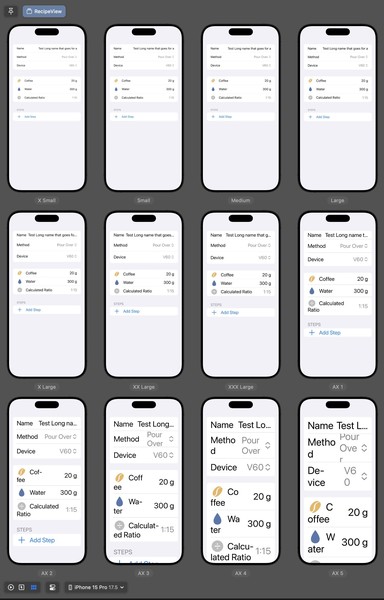
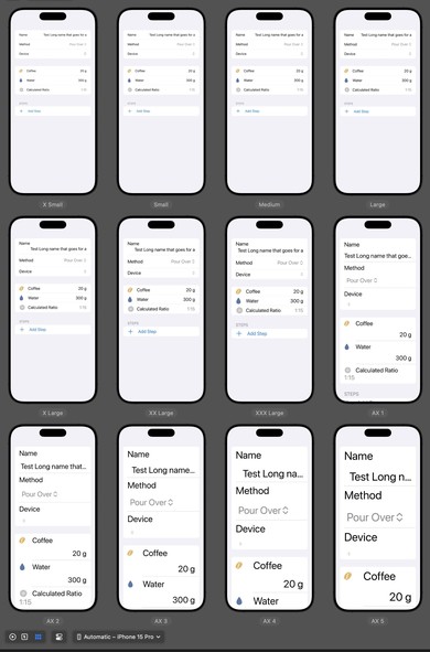
Yesterday I complained about #SwiftUI changes between iOS 17 and 18. Today, I’m applauding a change 👏 LabeledContent and Picker both seem to behave much better in a List with dynamic type! Previously I had to build my own version that switched to a vertical layout at larger sizes. Now the built-in views do it automatically.

Multiple screenshots of a "RecipeView" interface on an iPhone, showing how the app's layout adapts to various text sizes (from extra small to extra large). The content is laid out in a list of horizontally laid out items with a content label on the left and the content on the right. As the text size increases, the label and content both start to clash and compete for space which ends up cutting off a large amount of the text.

The same content as the previous screenshot. But this time, as the text grows, the content switches to a vertical layout with the label on top and the content on the bottom with a slight offset, allowing both the label and content to be readable even at the extra large sizes.
[Öffentlich] Antw.: 0 Wtrl.: 0 Fav.: 0 · via IceCubesApp