Zeitpunkt              Nutzer    Delta   Tröts        TNR     Titel                     Version  maxTL
Do 18.07.2024 09:30:49   191.476      -1    9.213.969    48,1 Mastodon                  4.3.0...   500
Mi 17.07.2024 22:00:04   191.477      -2    9.210.826    48,1 Mastodon                  4.3.0...   500
Di 16.07.2024 22:00:03   191.479     -29    9.202.399    48,1 Mastodon                  4.3.0...   500
Mo 15.07.2024 22:00:04   191.508      -2    9.192.694    48,0 Mastodon                  4.3.0...   500
So 14.07.2024 22:00:04   191.510       0    9.184.201    48,0 Mastodon                  4.3.0...   500
Sa 13.07.2024 22:00:01   191.510      -5    9.175.810    47,9 Mastodon                  4.3.0...   500
Fr 12.07.2024 22:00:02   191.515      -3    9.169.050    47,9 Mastodon                  4.3.0...   500
Do 11.07.2024 22:00:29   191.518      -2    9.159.911    47,8 Mastodon                  4.3.0...   500
Mi 10.07.2024 22:00:00   191.520       0    9.151.853    47,8 Mastodon                  4.3.0...   500
Di 09.07.2024 22:00:02   191.520       0    9.143.378    47,7 Mastodon                  4.3.0...   500
Drew Naylor (@DrewNaylor) · 04/2022 · Tröts: 7.964 · Folger: 122
Do 18.07.2024 20:08
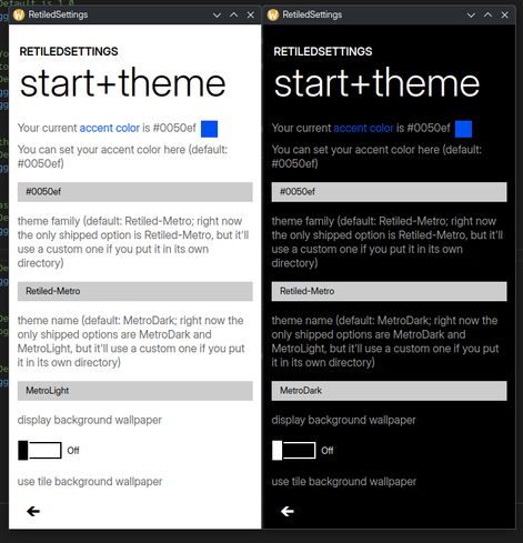
I noticed that I still haven't fixed the light mode toggle switches so I made them themable today.
#Retiled #MetroDesign #MetroUI #programming

RetiledSettings showing the start+theme page in both light and dark themes showing the toggle switches being black on white in the light theme and vice-versa like they're supposed to be. There's also textboxes for MetroLight and MetroDark according to which app has what. The theme is very square and minimal but easy to tell what's what, just like the Windows Phone 7 and 8 design. Big headers too, and the user's accent color, a nice blue called cobalt, is shown in the page.

Cropped screenshot showing the accent color filling a limited area inside the toggle.
[Öffentlich] Antw.: 0 Wtrl.: 1 Fav.: 0 · via Megalodon