Zeitpunkt              Nutzer    Delta   Tröts        TNR     Titel                     Version  maxTL
Sa 05.10.2024 00:00:25    11.963       0    1.095.949    91,6 Mastodon.green            4.2.10     500
Fr 04.10.2024 00:01:15    11.963       0    1.095.068    91,5 Mastodon.green            4.2.10     500
Do 03.10.2024 00:01:13    11.963      -1    1.094.037    91,5 Mastodon.green            4.2.10     500
Mi 02.10.2024 00:00:06    11.964      +1    1.093.043    91,4 Mastodon.green            4.2.10     500
Di 01.10.2024 00:00:19    11.963       0    1.092.060    91,3 Mastodon.green            4.2.10     500
Mo 30.09.2024 00:01:16    11.963      -1    1.091.087    91,2 Mastodon.green            4.2.10     500
So 29.09.2024 00:01:26    11.964       0    1.090.058    91,1 Mastodon.green            4.2.10     500
Sa 28.09.2024 00:00:40    11.964      +2    1.089.067    91,0 Mastodon.green            4.2.10     500
Fr 27.09.2024 00:00:22    11.962      +1    1.088.328    91,0 Mastodon.green            4.2.10     500
Do 26.09.2024 00:01:01    11.961       0    1.087.313    90,9 Mastodon.green            4.2.10     500
Christine Burns MBE 🏳️⚧️📚⧖ (@christineburns) · 11/2022 · Tröts: 20.364 · Folger: 3.059
Sa 05.10.2024 12:07
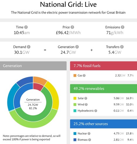
Saturday morning and gas is producing only the same amount of British electricity than the last (now defunct) coal plant had done. And you know coal has gone for good because Kate’s removed it from her marvellous dashboard. My price at home will be just 8p/unit in an hour from now and it’s 5g CO2 per kWh so there’s lots of saved-up laundry to put through the washer this afternoon. https://grid.iamkate.com

British electricity viewed on Kate Morley’s national grid dashboard. A concentric pie charts show shows the big picture in red (7.7% fossils), green (49.2% renewables) and blue (25.2% ‘other’ made up of nuclear and biomass). The outer ring breaks down this big picture into the sources (eg solar, wind, hydro) that make up the bigger category. The exact power and percentages are in a table to the right of the pie. An upper portion of the display shows the time, the wholesale price, the national average carbon emissions and the balance between demand, generation and imports/exports.
[Öffentlich] Antw.: 0 Wtrl.: 0 Fav.: 0 · via Metatext